Navigation 2.0
How we cut navigation time by 50% and reduced churn for 1,000+ enterprise teams
The Problem
Yellow.ai grew fast — from 12 modules at launch to 40+ in 18 months. The original sidebar was never designed for that scale. Every new feature was bolted on, and the result was a navigation model that made every workflow feel like a maze. During user research across 22 enterprise clients, we heard the same things over and over:
All 40+ modules had equal visual weight. Primary actions were buried next to utility links.
Every task required a journey. Opening last week's bot: Sidebar → Design Studio → Flows → Drafts. Every. Time.
The product had no idea what you worked on yesterday. Every session started from zero context.
Navigation friction was cited in 6 of 11 churn interviews that quarter. Users weren't leaving — they were getting lost.
"I know exactly what I need to do. I just can't find where to do it."
Research
We ran a 3-week discovery sprint before touching a single wireframe. The goal was to understand how users actually think about the product — not how we assumed they did.
Users don't think in modules — they think in workflows. They want 'yesterday's unfinished bot', not 'Design Studio → Flows → Drafts'. Navigation needed to be task-aware, not feature-aware.
Design Process
We explored 5 radically different navigation directions before converging. Each was prototyped and tested with 8 users before we narrowed.
The Solution
The final design isn't one feature — it's three interlocking systems that meet users at every point in their workflow.
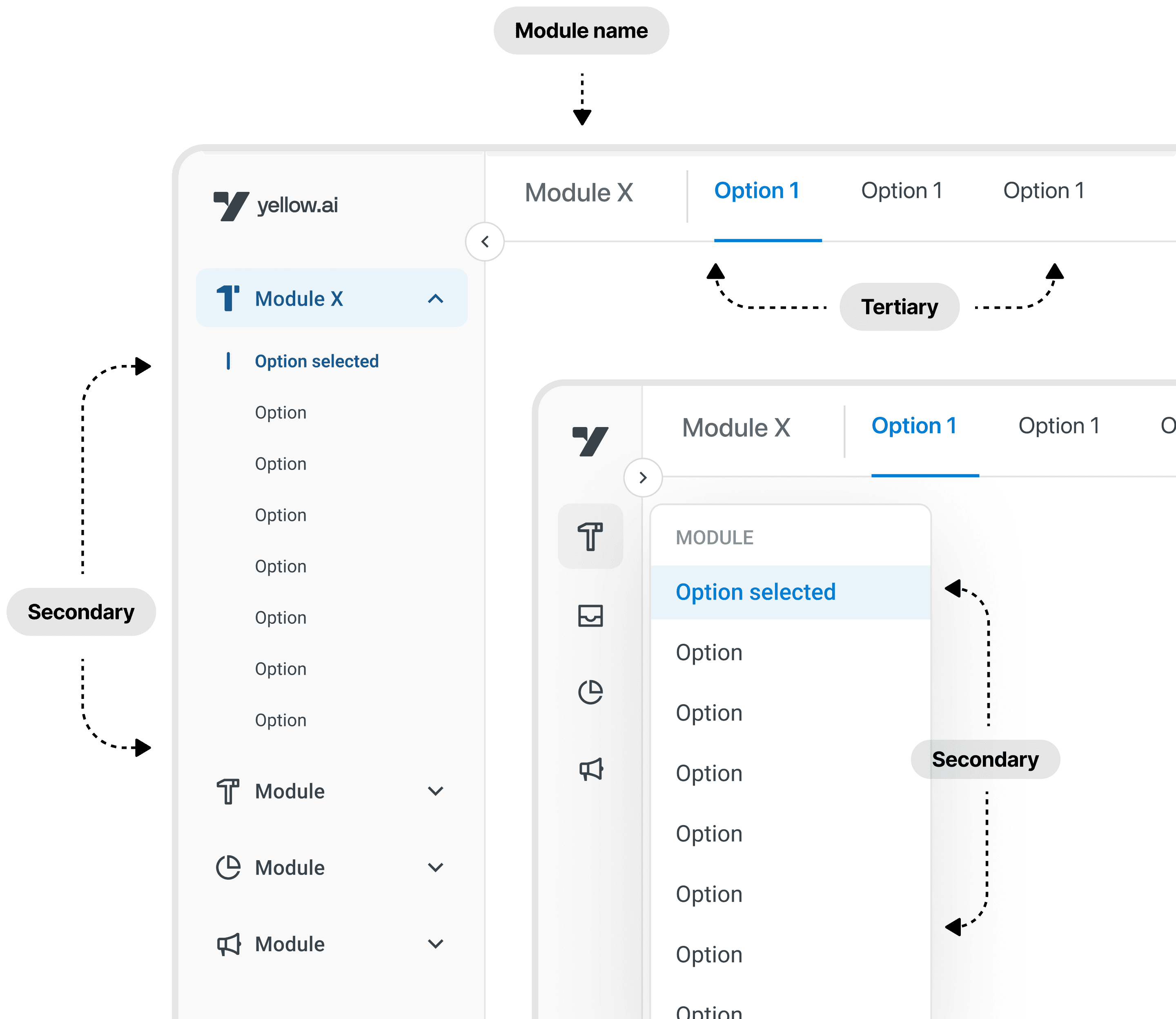
Primary modules always visible, weighted by usage. Secondary tools collapse to icons. A persistent favourites rail lets users pin their 5 most-used destinations — set once, remembered forever. The sidebar now speaks in the user's language, not the product's taxonomy.
- ✓Collapsible sections reduce cognitive load by 60%
- ✓Usage-based ordering — most-used modules rise to top
- ✓Favourites rail: drag-to-pin, persists across sessions
- ✓Contextual tooltips on hover for new users
The moment you log in: your last 3 open items, across any module, surfaced immediately. Click once. No breadcrumbs. No menu-diving. The product finally has memory.
- ✓Cross-module recency (bots, flows, integrations, reports)
- ✓Session-aware: different view per user in shared accounts
- ✓One-click return to exact context
- ✓Shown on home screen and in sidebar header
Spotlight-style search across every module, action, and recent item. Context-aware: typing 'flow' inside the Bot Builder surfaces flow-related results first. Supports navigation, creation, and actions all in one bar. 71% of users reach for it by default within 6 weeks.
- ✓Fuzzy search across 40+ modules + all user content
- ✓Context-aware ranking based on current location
- ✓Supports actions: 'create new flow', 'invite team member'
- ✓Keyboard-first with full arrow navigation
Outcome
We shipped to 5% of users in week 1, ramping to 100% over 3 weeks with monitoring at each stage. The results came faster than expected — and held.
"The new navigation feels like the product finally understands how I work. It just gets out of my way."
Navigation was cited in 0 of 8 churn interviews the following quarter — down from 6 of 11. Three enterprise customers specifically mentioned the navigation redesign in their renewal conversations.
Learnings
Users didn't want fewer clicks — they wanted predictable clicks. Once users knew exactly where something would be, even a longer path felt faster. Consistency is a feature.
AI-suggested reordering of modules felt creepy and unpredictable. Users actively complained about the sidebar 'moving things'. We dialled it back to usage-based recency only.
Power users and new users need fundamentally different navigation paradigms. ⌘K for experts. Recency feed for new users. We shipped both — and watched each group self-select into the right one.
Our ultimate success metric: users stopped talking about navigation entirely. When nobody mentions it in interviews, you've won.